
This is a case study for a location-based bar/pub finder that helps sports fans in cities foreign to them find where local fans supporting the same team watch sporting events.
Design Challenge
The challenge was to create a mobile application to help sports fans that follow European football find venues that are showing the game of the team they support no matter what city they are in.
Sporting events abroad are often at strange times of the day and require special streaming services making it hard to find a good place to watch. Some bars open their doors at these odd hours for fans to gather and watch the games, but they are often hard to find and they may not be showing ‘your’ teams game.
Project Details
January 2018 | Duration: 9 weeks, Part-time | ~90 hrs.
Solo project, working with mentor
My Roles
Research | Lead Designer | Branding | UX
Tools
Sketch | Trello | myBalsamiq | InVision | Adobe Illustrator

Research
Initial research was invaluable when it came to beginning the process of defining the projects MVP. Leveraging user surveys and competitive analysis I was able to steer the project in the right direction at an early stage.
Surveys
The goal of the surveys I ran was to understand how people currently use location-based search applications, what the most common location-based search applications are and to find out about location-based search applications that I was unfamiliar with. As well as, the positives and negatives of each.

Competitive analysis
I looked at the Yelp application, Bar Finder application and EPL Live application and found ample opportunity to jump into the market.

Personas
I did several follow up interviews to further define who our users were and what exactly they wanted and needed out of a product like Newlocal.


Information Architecture
I used my initial research to help define what was important to have in my MVP and help build the layout of the application.
User Flows
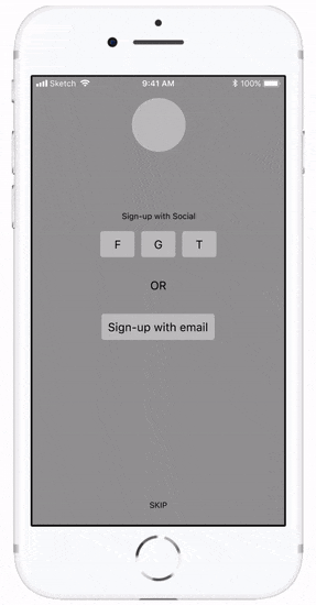
I mapped out several of the user flows paying particularly close attention to the sign up flow. The sign up flow was of extreme importance due to the app relying heavily on user inputs to help tailor their experience.

Sign-up flow
I tested the sign-up flow early to verify it was intuitive and what users would expect.
App. Hierarchy
Using the user stories and flows I mapped out the hierarchy of the main sections of the application.


Branding
What is Newlocal? What should it look like, feel like, and make users feel, most importantly how are we going to tell our story? I kicked off the branding process with some ideation and iterated from there.
Ideation
To help set the direction of the brand I started with some mind mapping and “whiteboarding” sessions until I was able to come up with the name Newlocal and define the values the branding would attempt to portray.

Color and Type
The color and typography chosen are meant to add to the values and goals of Newlocal and give the user a sense of trust without taking the fun out of it.

Logo development
I started by sketching ideas and iterating on those.

Icon focus
After sketching and exploring several different directions I kept coming back to the same theme of two fans embracing in a celebratory cheers.

Iteration
I did rapid iteration in Illustrator combining different elements and colors while maintaining the central form.

Final Logo

Wireframes & Mockups
After doing my initial research, defining my MVP and developing Newlocal's brand narrative I started to design the actual layout of the application.
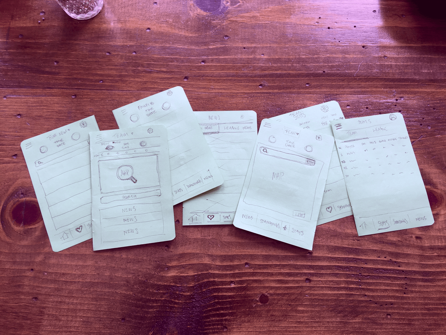
Sketches
I started to layout my ideas using a pen and pad to help visualize what the key screens of Newlocal would look like.

myBalsamiq Wireframes
I used my sketches as a guide and moved those into myBalsamiq to get a better idea of layout sizing and continued to iterate on the main ‘Map View’ screen.

HiFi Wireframes
I then moved the five main screens users would interact with from myBalsamiq into Sketch and started to nail down the exact sizing of elements.

Design mockups
Using my wireframes and my home screen as a baseline and applying my color palette I built out the rest of my design mockup in order to do some user testing.


User Testing
I was able to run user testing on my mockup prototype using InVision to ensure that the navigation within the application was intuitive.
Usability
I tested six different tasks, all of which passed with a 100% completion rate: (1) Open an article in the ‘Team News’ section. (2) Navigate to the ‘League News’ section of the app. (3) Edit app notifications. (4) Navigate to the ‘Team Stats’ section of the app. (5) Edit app preferences. (6) Open a search bar in the ‘Team News’ section.

Preference Testing
I still wasn’t that confident in my ‘Map View’ home screen so I did a preference test of three design mockups.

Design Revisions
Finally, I made several design revisions to increase the usability of the product and finalize the first version of Newlocal.

Retrospective
This was the first time I had to create a brand identity and it proved to be more difficult than I could have imagined. I spent a lot of time developing the logo and applying my color palette in different ways and I am still uncertain if it truly reflects what I want Newlocal to be.
Next steps would be to do some testing to gauge user’s reactions to Newlocal. I will also look to add additional features like a fan check-in feature so users know if the establishment they want to attend will have the environment they are looking for.