This is a case study for Fruition Brewing’s website redesign; a young brewery that opened in 2019 in Watsonville CA. Go check them out!

This is a case study for Fruition Brewing’s website redesign; a young brewery that opened in 2019 in Watsonville CA. Go check them out!
Fruition Brewing offers artisan craft beers that focus on quality and balance; two things that their previous website lacked. The challenge was to make them a fresh new website that matched their brand and the quality of their product. Something simple and clean that allowed a visitor to get the information they needed easily in a manor that reflected the quality and balance of Fruition’s beers.
April 2018 | Duration: 5 weeks, Part-time | ~70 hrs.
Sole designer working with Fruition’s founders
Research | Information Architecture | UX
Figma | Trello | myBalsamiq | InVision | Adobe Illustrator
I approached this problem from two sides. I first wanted to understand what users thought of Fruition’s current site and secondly, I wanted to learn what people understand about brewing and craft beer as well as what beer brands people like and why.
The goal of this first survey was to have users explore the site as it was and understand what they liked and didn’t like.

The goal of this second survey was to get a pulse on Fruition’s potential customers. What beer brands they like and why, what beer styles they are into, and how much do they know about the beer brewing process.

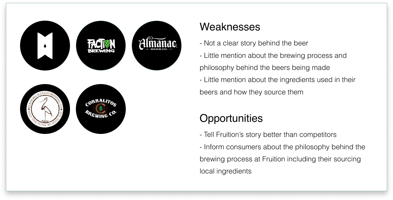
Who is the competition? How can Fruition differentiate themselves? How can they make their brand more appealing than other breweries through the content on their website?
Using the results from the surveys I conducted, coupled with the documentation on demographics and target market provided by the founders of Fruition I developed user personas to help guide the design process.
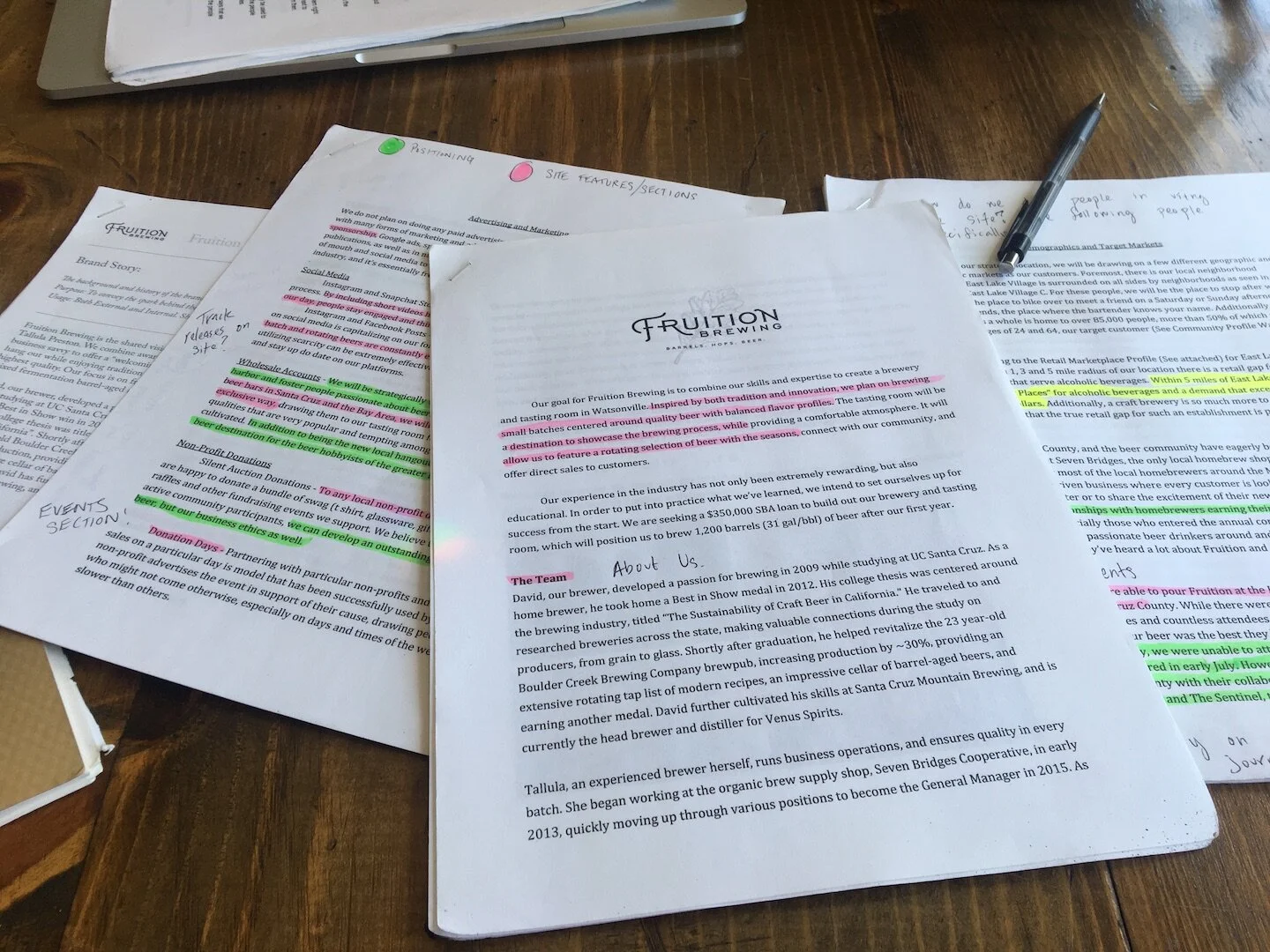
I used the documentation provided to me by the clients as well as my initial research to help build the layout and decide what was important to include on the website.
I built out user stories using the information I had gathered and from there I developed user flows to help visualize the user's interactions within the site.

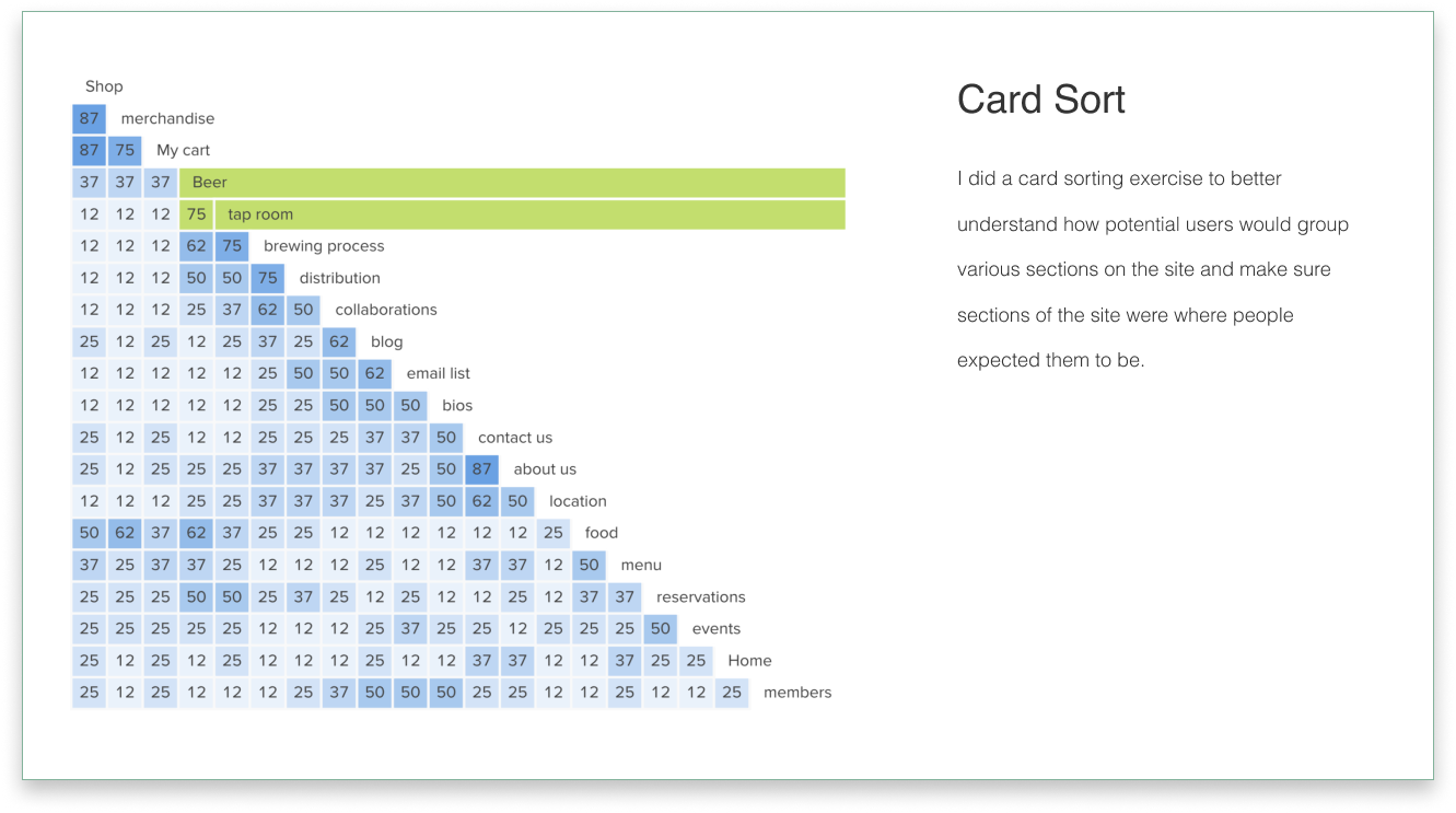
I did a card sorting exercise to verify content groupings on the site.
Compiling the results of the card sort and my user flows I built out the site map. The green highlighted sections represent what will be on the site today, and the red highlighted sections show the additional pages that will be developed as the business matures.

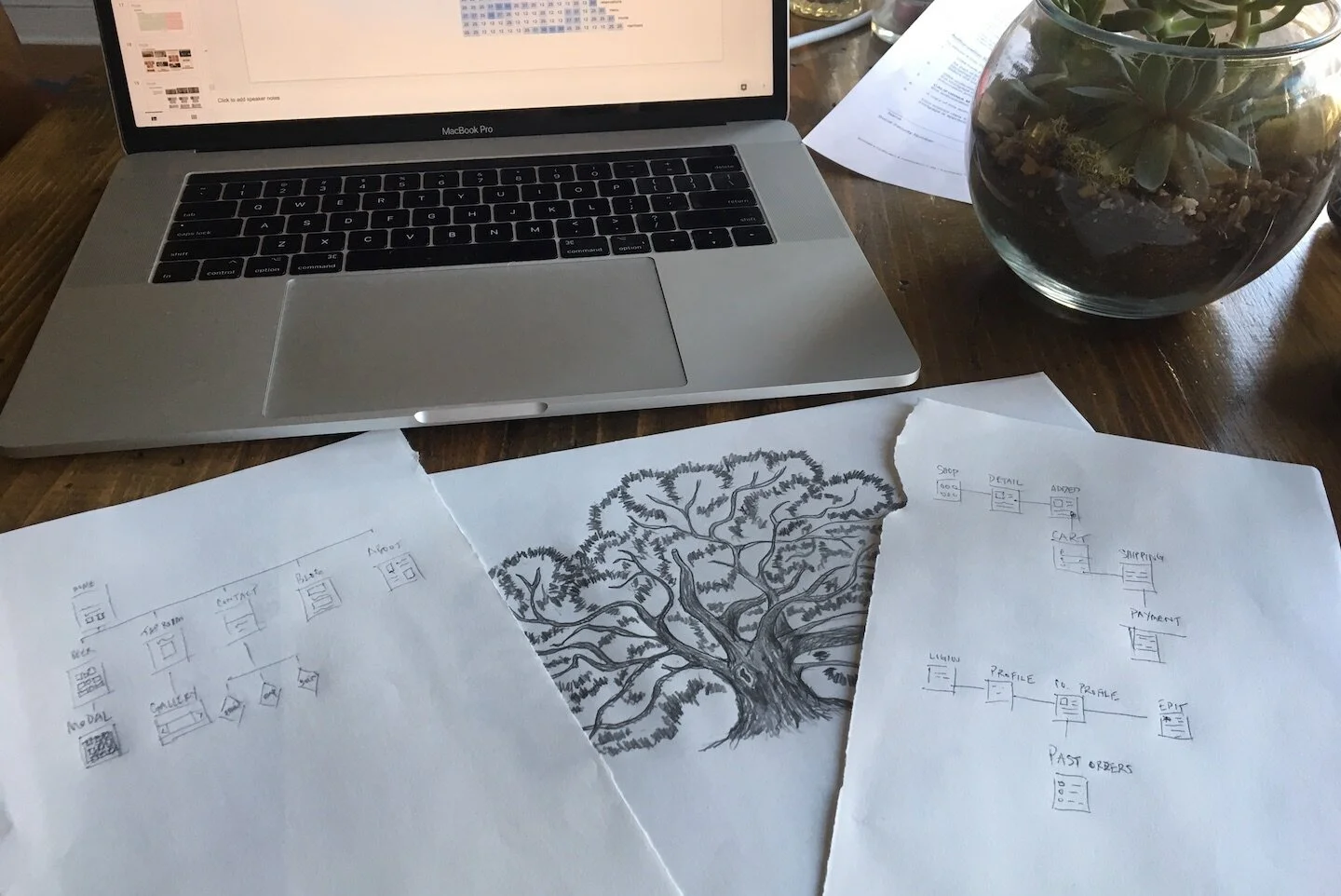
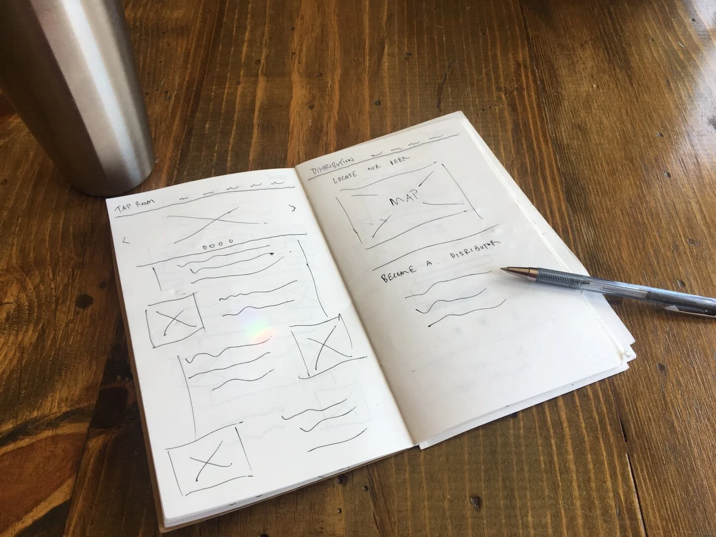
After wrapping my initial research I started iterating on layouts. Moving from sketches to mockups, critiquing, refining, testing and repeating.
Sketching is where everything really started to take shape. I was able to quickly iterate on ideas with a pen and pad. Sticking to some main themes and seeing where those took me.

I moved a couple of my ideas into LoFi mockups, bringing several options to the clients to get a better sense of what they were envisioning.

After getting feedback from the client I built out the rest of the layouts for each of the pages of the site in order to do some early user testing.

I tested the HiFi mockups to ensure that the information was organized in an intuitive manner and the site flowed.

All participants were able to complete the four (4) tasks with a 100% completion rate:
1. Find the details about Fruition’s Pale Ale.
2. Find the current food menu.
3. Locate information about David Purgason the head brewer.
4. Locate the companies email address.
I then did some final preference testing to help answer some design decisions I had been unsure about (i.e. Form vs Email link).

After compiling the results from testing and going through design critiques I made several UI revisions; following are some of the key revisions.

This project was a great exercise in client communication and the importance of helping clients understand design decisions. At times I struggled to get information that I needed from the client to keep the project moving forward and it helped me develop better ways to communicate.
The branding for this project was done by another company which helped me learn how to apply someone else's branding guidelines where applicable.
This project also reinforced that sometimes less is more. A lot of features of the site were left out partly because of the maturity of this business, but also because they didn't really add to the user's experience.
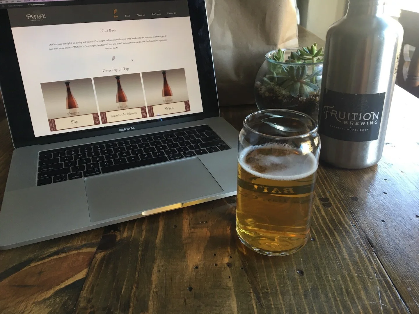
I ended up building Fruition’s site for them using Squarespace, but they have made some of their own edits since then. You can checkout their current site at www.fruitionbrewing.com.